

Wait, how many Americans eat how much pizza?
Wait, how many Americans eat how much pizza?
According to a recent Netflix show, the number is unbelievable. Literally.

You can find all the data and code for this post here.

Here’s a trivia question for you: what percent of Americans eat pizza every day?
Okay, this isn’t really a fair test since the fact that I’m even asking this primes you to think of a really high number.
But in fact the number is really high, according to a popular and brainy new food science Netflix show “You Are What You Eat”: a whopping 13% of Americans.

You’re probably confused because this looks like a pretty small number … but think again.
Thirteen percent of Americans is roughly the total number of African Americans in 2024. Thirteen percent of Americans is 300 times the pizza capital of the United States (according to one guy … let’s not argue that part) and 15 times the size of that capital city’s state. And if that doesn’t dough it for you: thirteen percent of Americans is more than the size of California.
That is a serious slice of the U.S. population.
If this is true, forget the other seccession that’s currently on the table: this pizza the pie is a much bigger threat to the state of the onion.
We never sausage a thing before. We really knead to take this seriously.
Does every Californian (13% of the U.S.) really have a twin pizza addict somewhere out there?
Because I’m a fungi (🍄), I decided to get to the bottum (🫃) of this substantial claim.
There has been, in fact, a long-standing government survey of Americans’ eating habits that can help us investigate: the CDC’s National Health and Nutrition Examination Survey or the NHANES.
In particular, there is a dietary interview component of this survey called “What We Eat in America,” where participants’ are asked to provide a detailed breakdown of their food intake on two separate days about a week apart which is then (without getting too technical) re-weighted to account for non-response and demographic skews.
For starters, I downloaded these interview responses for a recent pre-pandemic year and counted the number of respondents who cited ‘pizza’ (of any kind) in their dietary recall.
Here’s the kicker.
Weighted to the U.S. population, according to these interviews, 13% of respondents consumed pizza on any given day.1
This is not the same as 13% of respondents consuming day every single day.
Those respondents were not asked about their food consumption every day of the week, just on the days they were interviewed.
Put differently, possibly the best survey we can find on American food consumption tells us that 13% of Americans eat pizza every day, but it may be a different 13% every day. One day, the entire state of California turns out for ‘za, the next day every Gen-Xer in America takes to the slice.

Bad stats or word tricks?
One might argue that I’m turning an linguistic problem of “quantifier scope ambiguity” into a statistical one: the statement “13% of Americans eat pizza every single day” is consistent with either a wide scope (there exists some 13% of Americans who eat pizza every day) or a narrow scope (for every day, there exists some 13% of Americans who eat pizza).
So the experts on this show are technically not incorrect.
Much worse, they are factually misleading.
In most cases where scope ambiguity arises in colloquial speech — certainly scientific communication — it should be pretty clear what the correct scope reading is. If I tell you “there’s a cat in every city,” I’m obviously referring to the narrow scope (for every city, there exists a cat) and not insinuating the existence of a single giant furry monstrosity stretched over all the urban centers of the world.
In the Netflix show, however, every possible cue suggests that we should be interpreting the statistic according to the wide scope. This is just one statistic in a long delivery of other statistics meant to illustrate that Americans are profoundly unhealthy. We are supposed to react with shock and intrigue.
The bottom line is that if you generally think like a human, you, as a viewer, will leave this episode thinking the wrong thing about your fellow pizza-loving Americans. Which begs the question…
How many Americans do eat pizza every single day?
Unfortunately, pinning down this exact number is much harder precisely because of the staggered way dietary interviews are conducted.
There is, however, a dietary screener interview for the 2010 NHANES survey that includes a question that gets close:
During the past month, how often did you eat pizza? Include frozen pizza, fast food pizza, and homemade pizza. You can tell me per day, per week or per month.
Using this question, for each respondent we can calculate the ‘rate of pizza slice eating’ per the unit they decided to report. But here’s the problem: how should we interpret someone who says “I eat 7 pizzas per week”? It would be a stretch to assume this is evenly distributed across weekdays (for everyone except that guy I always see outside the pizza place on my block2).
Still, if we count and weight all respondents who report a rate of at least one pizza per day — ignoring the reported unit — we could extrapolate this to say 12% of Americans have at least a slice of pizza per day. Again, it would be safe to assume many of those respondents actually concentrate that ‘za-ing on one or two sit-downs across one or two days. So, this is, at best, a generous upper bound for our number of interest.
On the other hand, if we’re being conservative and only count respondents who explicitly say they have at least one slice per day, we get arrive at (drum-roll please): 0.5% of Americans have at least a slice of pizza every day.
Putting aside the fact that Nearly Zero to 12% is a huge and uninformative range, there are two issues with this question.
First, the question of ‘how often did you eat pizza this month?’ may be interpreted by respondents as ‘on average, how often did you eat pizza this month?,’ thus including many people who are going off vibes — and likely recent vibes — alone, rather a meticulous count by the receipts. This speaks to larger, fundamental issues about survey research; it is likely that your credit card company or Venmo (okay, maybe not Venmo) could give us better estimates of Americans’ pizza consumption.
The second issue is that this screener technically asks representatives of households and not individual respondents. It is also a stretch to impute this representative’s answer to each of the 1.5 other members of their household. All else equal, this likely shrinks both ends of the range.
The bottom line is that, almost surely, less than 13% of Americans eat pizza every single day.

Americans are undoubtedly not the paragons of healthy eating — even according to other accurate statistics about pizza consumption! So this sort of misinformation both undermines the credibility of its purveyors and is ultimately unnecessary to even make the point. And whether in a deliberate act of spinning ambiguous quantifiers or in a moment of sloppy recall, the experts on ‘You Are What You Eat’ — supposedly rife with other crimes of statistics — indeed misinformed their audience.
And I must say: left unchecked, this is a serious incrustice to laypeople who mostly learn about nutrition, health, lifestyle, not least to say politics through this kind of media.
Simply put: there is mushroom for improvement in the accurate reporting of statistics in pop science.
Now, if you care not for pizza (or pizza puns, if there’s something really wrong with you) and live only for politics, as at least a few of my usual readers may be, this next bit(e)’s for you.
What eating pizza and watching Fox News have in common
Well, the first thing is that the American public is being demonstrably misinformed by both pizza and Fox News. Go figure.
The second thing is a more interesting one: it is difficult to count consumption of both for the same reasons.
Like pizza for nutrition, Fox News plays the villain role for American political news (and possibly American Politics as a whole). To be sure, the perceptions of influence are not entirely unjustified: there are high-quality studies that demonstrate the causal effects of Fox News exposure on mass political behavior.
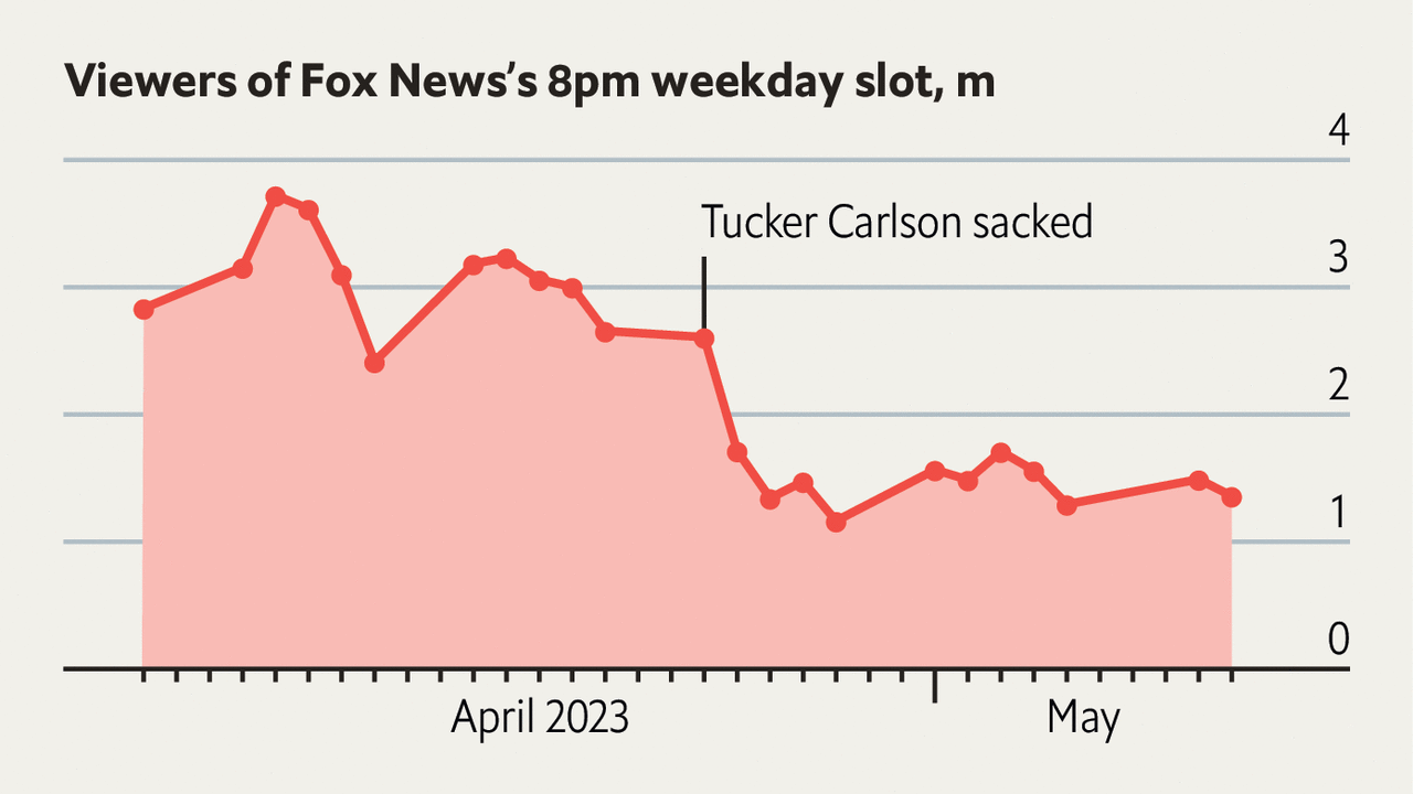
But, as with pizza, the audience for Fox News is hard to count. Self-reports of exposure to political news programs, as political scientist Markus Prior showed, are wildly inflated for a whole host of reasons relative to Nielsen rating estimates, which primarily rely on passive metering devices hooked up to television sets. The best estimate the latter is able to give for the typical nightly audience for a Fox News Prime Time program is around 4 million eyeballs. Unlike our pizza statistic, this seems like a surprisingly low number, only about 3% of the typical voter turnout in recent elections. And that’s in months before Tucker Carlson’s departure, after which this eyeball count has dropped even lower.
What gives? How could a news network with such a tiny audience (on the yardstick that matters) command such outsized attention, influence, and ire?
As in the pizza case, it depends on whether it’s the same 3% of voters or a different 3% every night. Indeed, if a different 4 million Americans tuned into Fox News every night, this would capture every American voter’s eyeballs in the upcoming election in less than two months. The answer is likely somewhere in between but, like with pizza junkies, we need better methods (and data) to count this better.
Political scientists David Broockman and Josh Kalla have, in fact, done this by combining data from a number of different passive metering devices disaggregated at the individual level.3 They find a sizable portion of Americans — about 13% (no joke) — do consume a substantial amount of Fox News (8 or more hours a month or the equivalent of an entire half-hour Prime Time news broadcast every Monday through Thursday) every month.
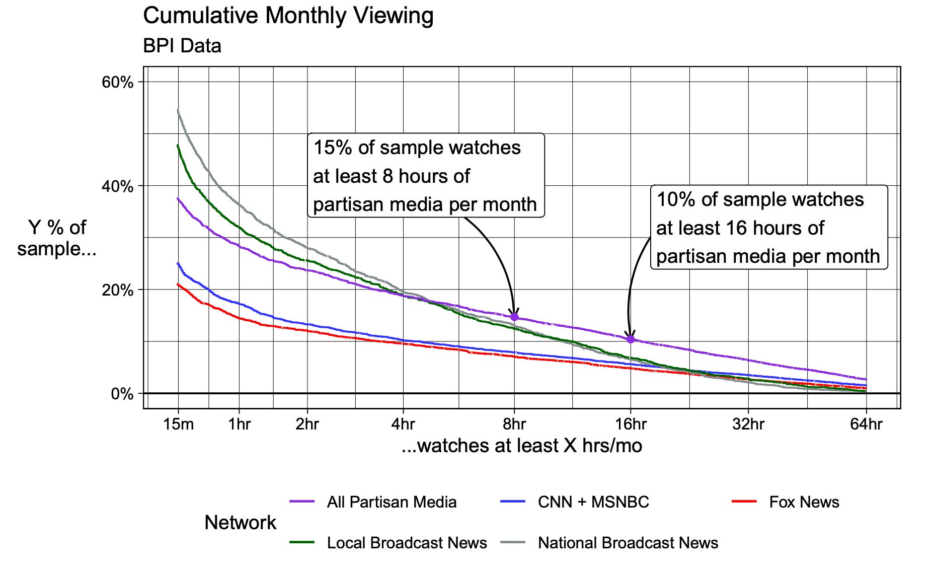
This is still not enough of a dosage to cover the entire American electorate, but certainly enough to squash skepticism about Fox News’ persuasive potential given its low nightly aggregate viewership.
In general, the lesson to learn here is that counting is hard and there are all sorts of techniques — diary studies, passive metering devices, and an entire field called audience measurement — solely dedicated to the task. If a fellow pizza enthusiast wants to run with those techniques, ideally with paid incentives and better yet in a full fledged Netflix show, on a willing participant, you can count4 on an n of at least 1. Until then, another one (me) bites the crust.
Credit to my partner, Muriel, for ins(pie)ring this blog post.
Edited to include a clarification about quantifier scope and discussion of Broockman and Kalla’s work.
Confirmed by the administrators of the NHANES/WWEIA data (from USDA) here (albeit, from an earlier wave of the survey, but this number has remained pretty stable over time).
Crown Heights Pizza, if you’re wondering, and yes it’s the best pizza place around. No, I don’t know who that guy is.
Political scientists Taylor Carlson and Eunji Kim are, at the time of writing, also working on this, working paper forthcoming.
Yes, this was also a pun, thanks for noticing.